
ĀRogya Health
An innovative mobile application that leverages augmented reality (AR) technology to revolutionize the way people manage their medication intake. This cutting-edge mobile app aims to enhance health literacy, improve medication adherence, and empower users to take control of their health by providing a comprehensive and interactive guide to medication intake.
I created the app with the goal of enhancing the users’ health literacy and medication compliance as well as promoting better health outcomes through innovative and interactive technology.
-
UX Research, UX Design, Visual Design, UI development, AR development, Prototyping, Usability Testing
-
AdobeXD, Augmented Reality, SwiftUI, Xcode, Figma, Miro, Illustrator, Photoshop, Invision
-
Solo project, Mobile app, AR app, IOS
Problem
One of the invisible issues that people face today is a lack of Health Literacy. Taking care of our health is part of everyday life, people need to understand how to read medicine labels in order to take good care of their health.

“62% of uninsured adults and 50% of insured adults were not able to answer a simple question regarding when they should be taking their medication”

“Every year in the U.S., there are about 125,000 deaths that could have been prevented if patients had been taking their medications correctly”
Research
Literary Research & User Interview
To develop a thorough understanding of the problem of health literacy in relation to medication adherence as well as to gain insight into people's behavior and requirements about their challenges with medication compliance.

Research papers and Articles from international health organizations
The majority of existing medication management apps primarily emphasize tasks such as organizing pill cases, setting reminders, and issuing refill notifications. It is crucial to recognize that ensuring the safe consumption of medication holds equal significance.
15 user interviews with different demographics
This highlighted people's medication adherence routines, habits, motivations, beliefs, and stigmas. Individuals aged 50 and above encounter greater challenges in adhering to their medication regimen compared to younger adults.

Competitive Analysis
This gave me a comprehensive understanding of recommendations and strategies related to medication adherence. Utilizing input from users and research findings, I mapped down the reasons for the problems and possible solutions.

Problem Statement
With the advancement of technology, how might we improve patient technology to provide user-friendly and easily accessible medication information?
User Journey
I created a user journey map to uncover user needs and pain points and how users engage with the app. This map outlines various touchpoints and offers a comprehensive view of the user experience, aiming to improve their overall journey.
Meet Lisa Mitchell, a dynamic and resilient 52-year-old woman residing in the bustling city of Chicago. Juggling the roles of a dedicated single mother of two girls and a hardworking salesperson at a leading departmental store, Lisa's life is a testament to her unwavering determination and boundless love for her family.
“It is difficult to routinely remember medication adherence when juggling a busy lifestyle and the difficulties of aging.”

Ideation
With the in-depth insights gained, I brainstormed different ideas, and finally, with the goal of crafting easily reachable and visually intuitive information using simple language about medication adherence, I compiled a set of essential features.
Easy

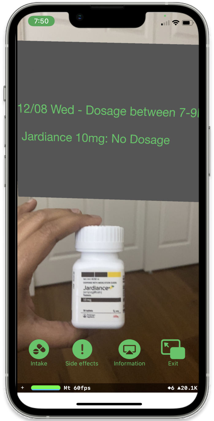
Use the camera to scan the medicne instead of manual input to retrieve information, and present the details on the same screen.
Visual

Visual display of all the crucial details of a specific medicine in a comprehensive manner, efficiently displaying them on a screen.
Simple

Instructions regarding medication adherence, presented in a clear and uncomplicated manner, ensuring readability and clarity.
Future Scope Model
The app suggests incorporating this feature in its upcoming updates aimed at enhancing the user experience. In its initial stages, the app could establish partnerships with provider portals, streamlining the synchronization of prescriptions. Subsequently, the app could utilize artificial intelligence (AI) to calculate dosage intake and provide alerts for potential drug interactions with other prescriptions.
Usability Testing and Insights
I decided to carry out user testing on both the low-fidelity paper prototype and the first iteration of the augmented reality prototype to scan the medication in order to learn more about user viewpoints and deepen my understanding.

On the home screen, emphasis on the most significant components. A lot of details might be perplexing.
It is inconvenient to constantly hold the medicine in front of the camera to access the information.
After carefully analyzing the valuable insights gained from the low-fidelity paper prototype, I decided to take the intentional step of progressing the design process by developing a medium-fidelity prototype. This strategic decision was made to further enhance and refine the design, allowing for a more comprehensive exploration of its potential.

I learned that medium-fidelity design gave me a clearer understanding of element spacing, content structure, and click interaction, ultimately fueling my ideation process with improved insights and perspectives.
Final Designs
With a strong focus on catering to users across varying age groups, I meticulously designed a high-fidelity application interface that seamlessly incorporates versatile options of both light and dark modes, ultimately enhancing the user experience.


Insight
In contrast to the application screen shown in the Adobe XD design, the button menu in the augmented reality (AR) prototype displays a totally different user interface design. The labels are currently not perceptible to the viewer. Additionally, improve and refine the visual appearance of the text elements in the AR prototype.

Improvement
I employed the same color scheme to maintain consistency with the rest of the screens. I chose the buttons to be larger, enhancing visibility and overall aesthetic appeal within the AR prototype. I modified the textual composition and the design of the plane within the augmented reality prototype, resulting in enhanced legibility and readability.

Reflection and Challenges
What did I learn about myself as a designer through this solo project?
Doing everything on my own, from research to AR development, showed me how much I value structure when working independently. I learned to make deliberate decisions at each stage rather than jumping ahead. The shift from low fidelity to medium fidelity was a turning point for me because it gave me a much clearer sense of spacing, content hierarchy, and interaction before moving into high fidelity design.
What was the most significant shortcoming in this project?
The biggest shortcoming was not being able to test with a more diverse group of participants. Because the project involved medication, IRB approval was required, and by the time it came through, the deadline had already passed. This meant the research leaned on a narrower demographic, which limited how thoroughly inclusivity was explored, especially given that the primary users were adults aged 50 and above.
What did the AR development process taught me and where did it fall short?
Building the AR prototype taught me that designing for augmented reality is a completely different challenge than designing for a flat screen. Legibility, button size, and visual consistency all behave differently. The honest shortcoming was that the AR interface still felt somewhat separate from the rest of the app, and with more time I would have worked to make both feel like one unified experience.
What would I build on or do differently with more time?
I would have expanded the features to cover more of what real medication adherence actually involves, since the current version only begins to address it. The AI features around dosage calculation and drug interaction alerts were always part of the vision, and given more time, I would have brought them into the product rather than leaving them as future scope.